
Where Responsible Design Begins
A refined brand system with a clear point of view.
NYC Creative is a sustainable packaging studio operating in an industry not known for design ambition. Most competitors lead with utility. The opportunity was to lead with craft — and let the quality of the identity signal the quality of the work.
I developed NYC Creative's complete brand identity from the ground up: naming expression, logo design, color system, typography and website visual direction. The challenge was building something that felt premium and considered without tipping into cold or inaccessible — sustainable design shouldn't feel like a sacrifice.
The result is a monochrome system grounded in clean typographic hierarchy, intentional whitespace and warm tactile details. It's a brand that earns trust on first impression and holds up across every format — from a business card to a B2C website to a packaging mockup.
Design Decisions
-
In a category full of visual noise, a monochrome palette with generous white space communicates confidence. The identity doesn't need to shout because the work speaks for itself.
-
With no illustrative elements or complex iconography, the entire personality of the brand lives in typographic hierarchy and spacing — which demanded precision at every size.
-
NYC Creative sells to businesses and consumers alike. The identity was built to impress people who know what good design looks like.
Visual Identity

NYC Creative: Brand Elements

NYC Creative: Brand Stationery Suite
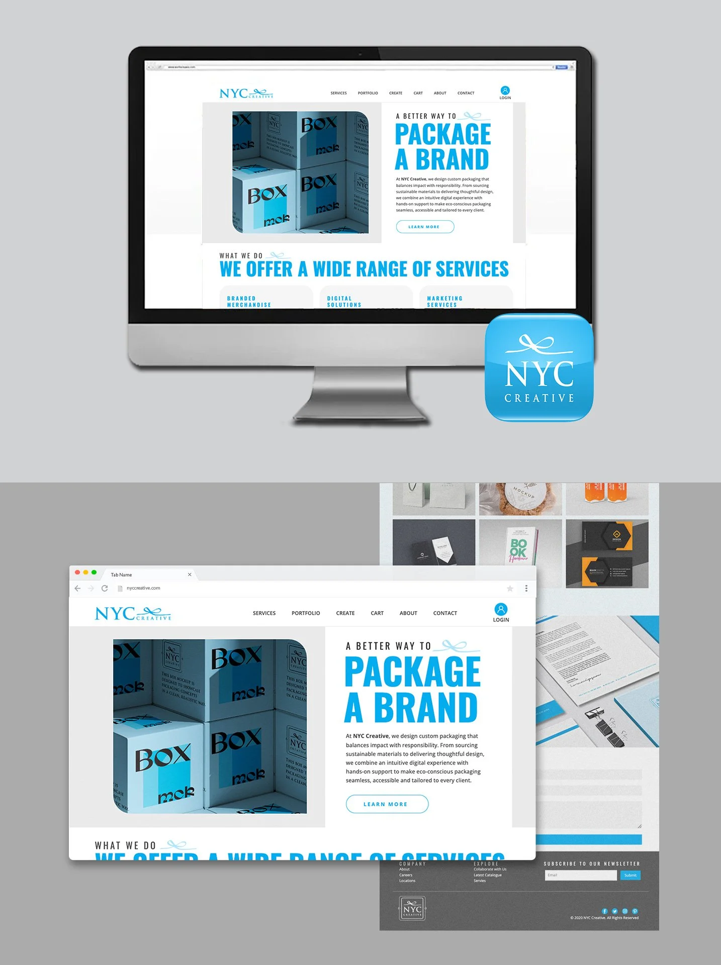
NYC Creative: B2C Website Mockup
Brand Guidelines
breaking the